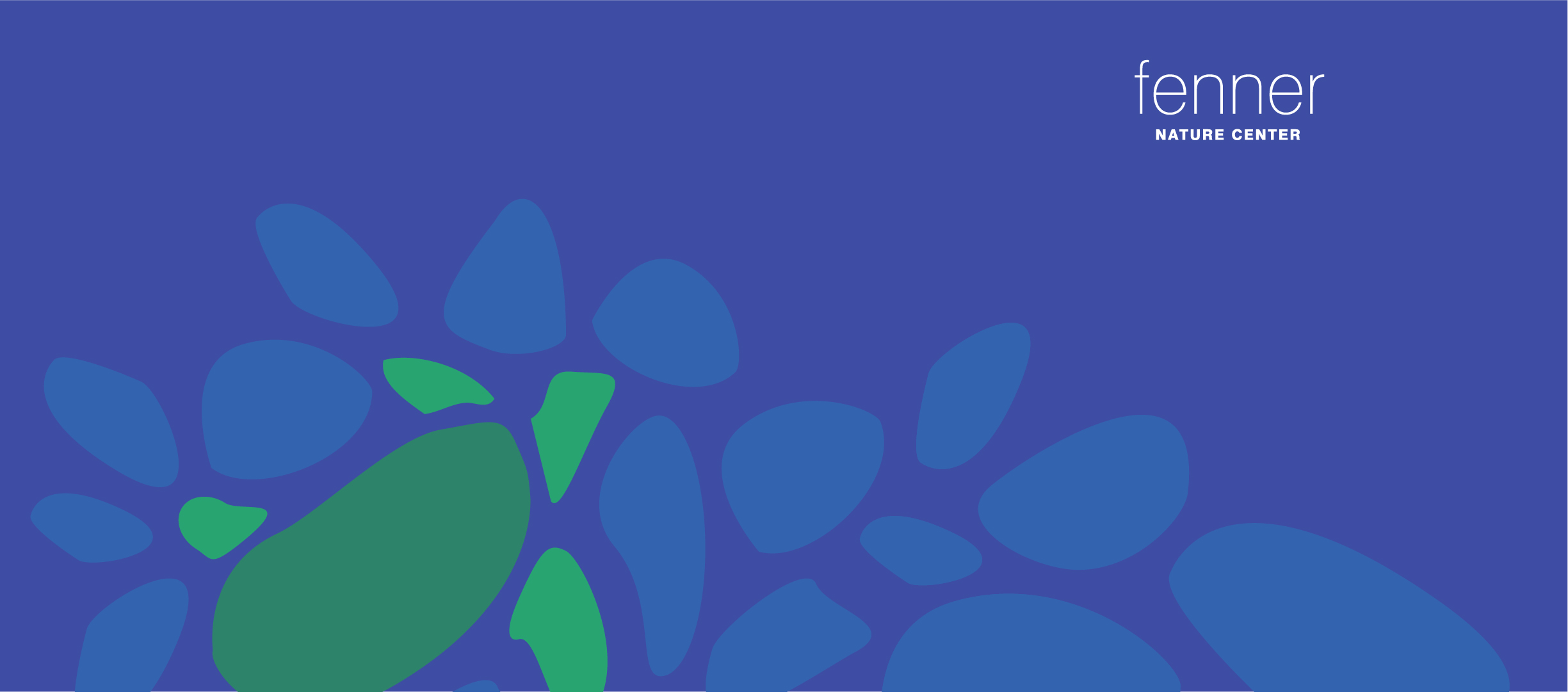
Fenner Nature Center
The Fenner Nature Center is an oasis, a doorway into the natural world tucked in the heart of Lansing, Michigan.
The Challenge
Refresh the Fenner brand, while retaining their current logo. The organization had commited to their facebook inspired lettermark and they weren't ready to part ways.
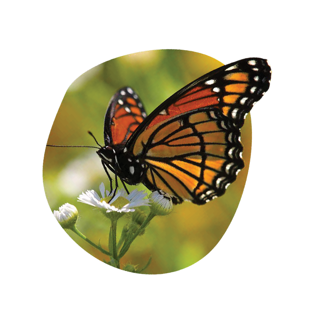

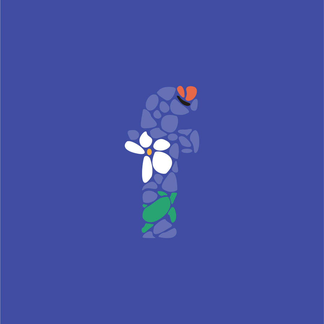

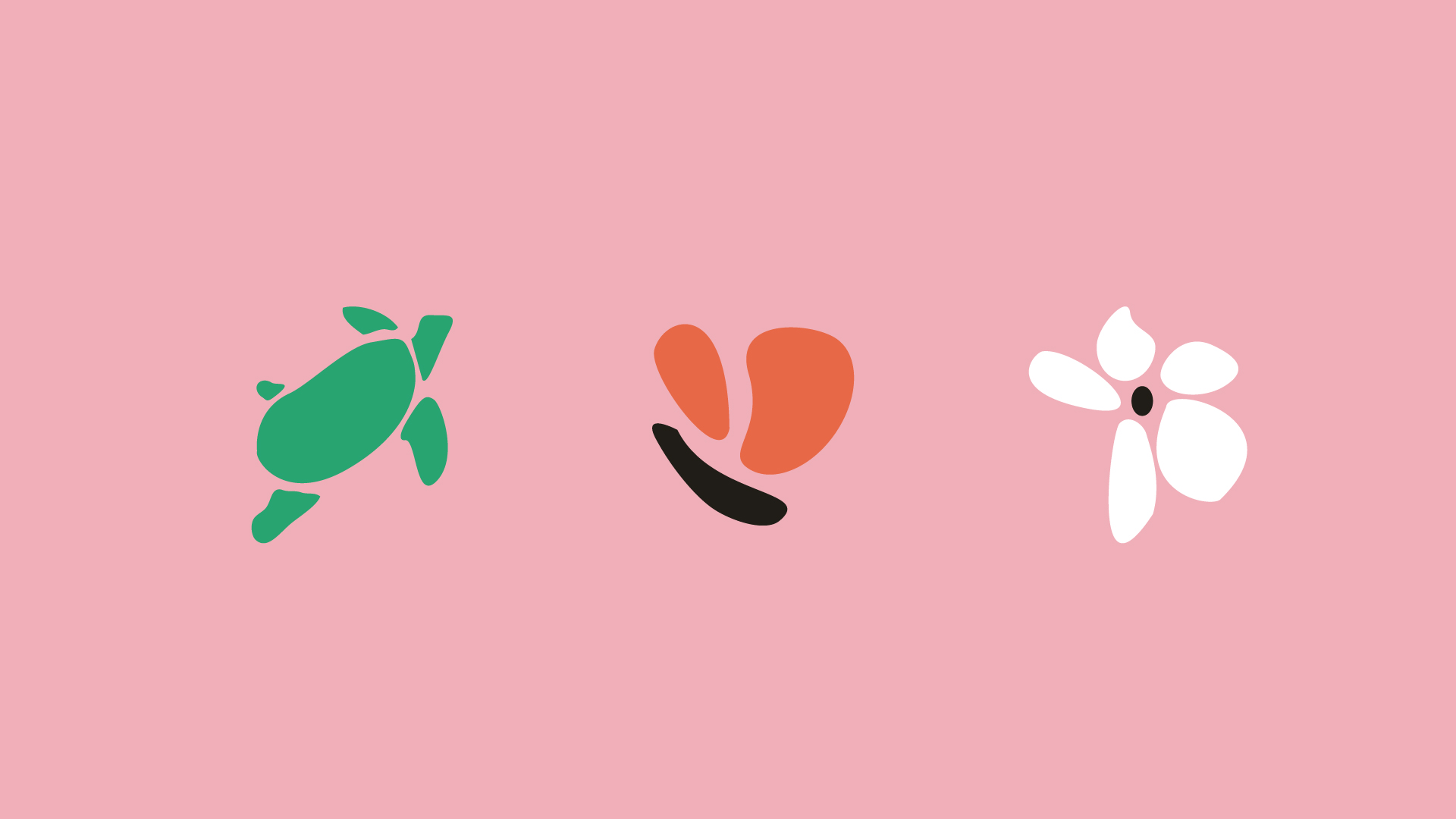
Hidden illustrations within the mark were originally intended to serve as a secondary icon system for their internal structure — the nature center, the conservancy and the nature based preschool .
The Solution
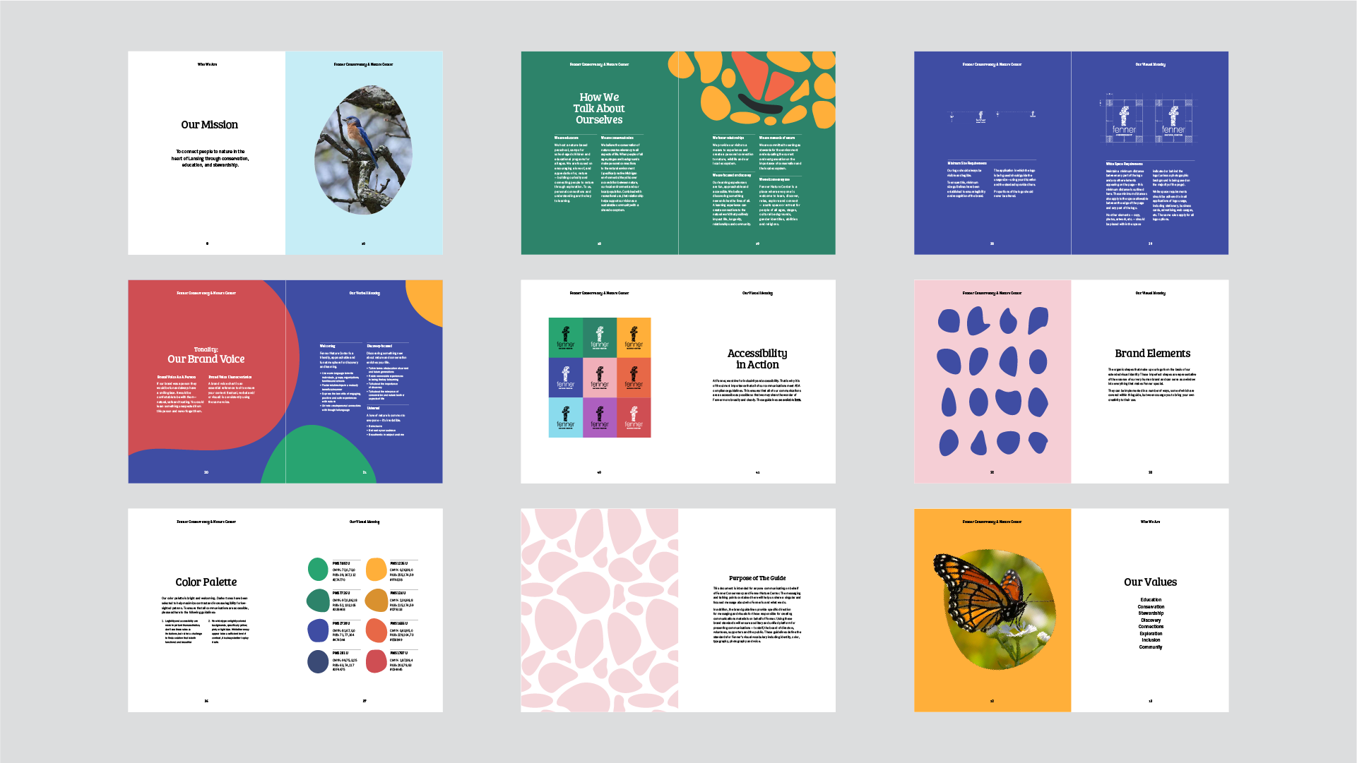
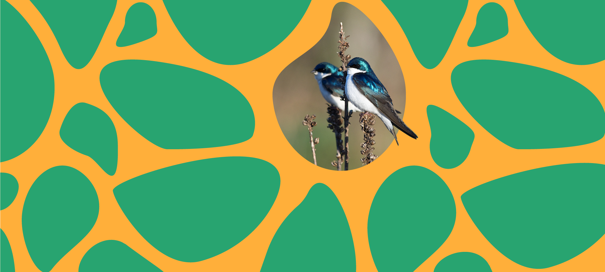
The soul of the Fenner brand exists where the community and nature connect. So the brands story came to represent that engagement. The illustations being representative of nature while the surrounding stones represent the diverse community Fenner serves.
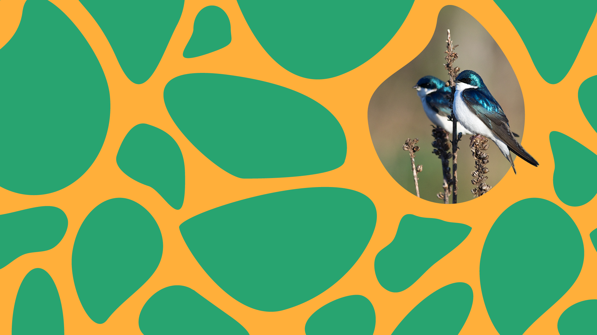
The stones also grew to become a pivotal brand device, allowing us to further showcase that interaction.
As a pattern, illustration, and graphic device, we are able to open a window into the world one might expect when they visit the nature center.
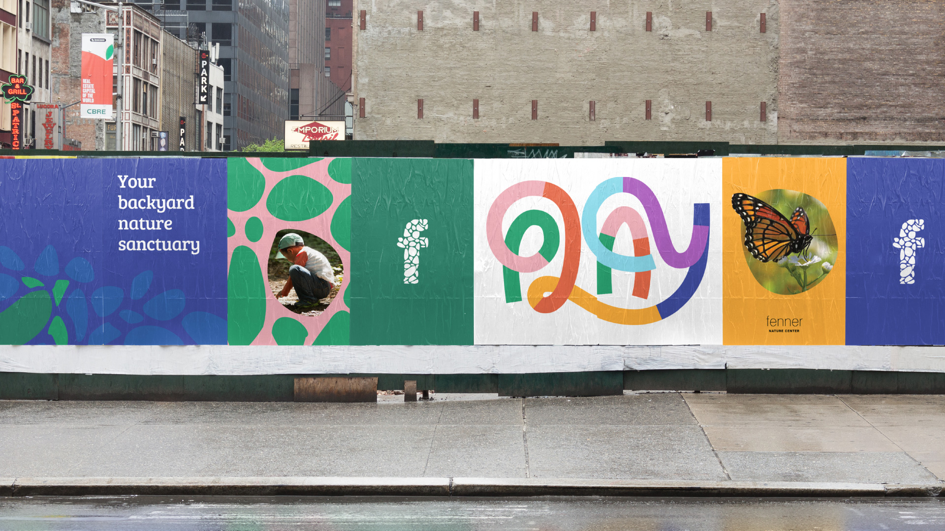
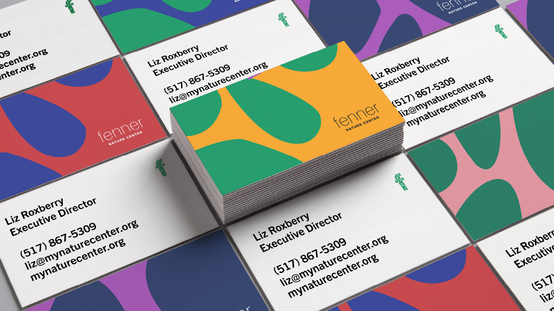
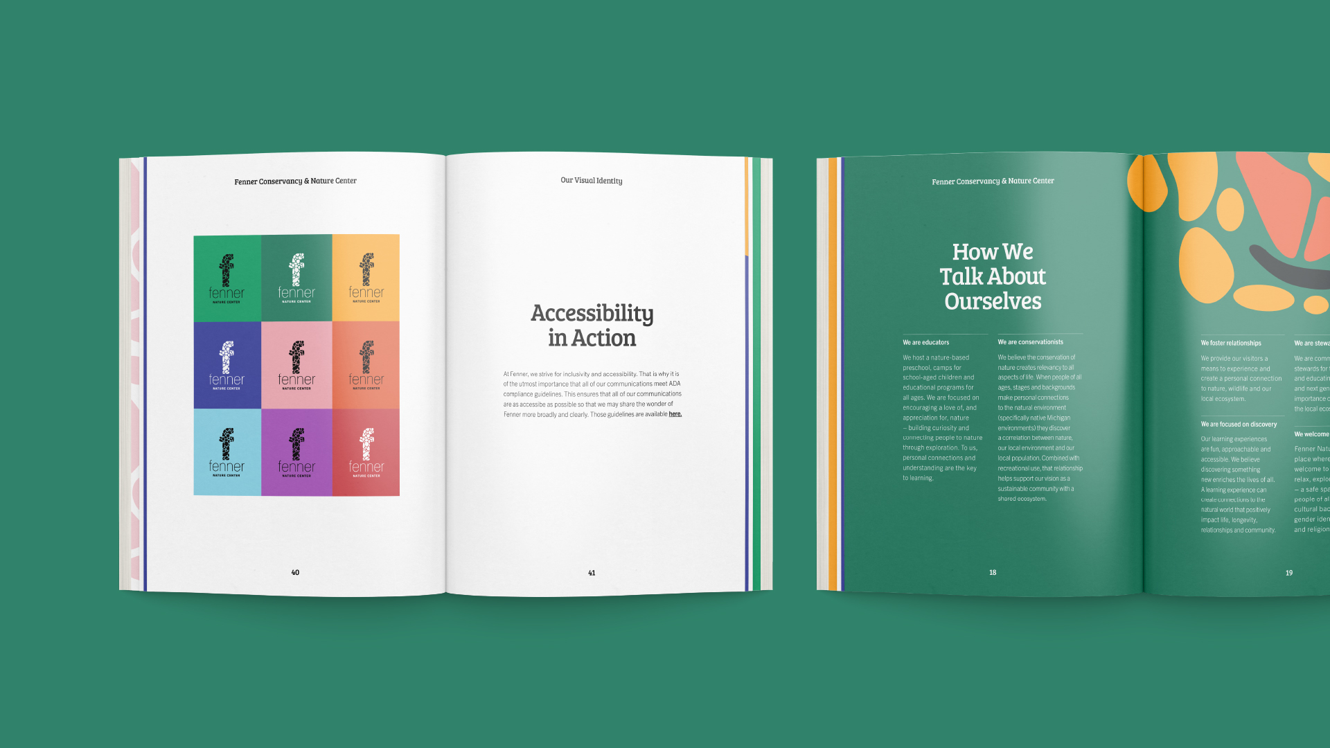
Accessebility is a huge part of the Fenner brand. So it was important that all visual communications be as legibile as possible. This meant a thoughtful use of type and intentionality in the application of color.
Credits
Role: Art Director, Lead Designer
Client: Fenner Nature Center
Year: 2019
Agency: Gud Marketing
Creative Director: Amy Moore
Copywriter: Dave Busch
Selected Works
Fenner Nature CenterBrand Design

Franklin FieldsProject type
Two Degrees°CreativeProject type
Type & LetteringProject type
LogosProject type