Franklin Fields
Michigan’s premiere cannabis cultivator on a mission to enrich people’s lives through clean and cared for cannabis.

The Franklin Fields brand was built to be flexible, functional and expressive. Dreamy textures, approachable messaging, and bright unexpected colors help this brand stand out.
The wordmark is modified to include a custom r-a ligature which provides a subtle surprise intended to delight the audience. Additonally, this connectivity is intended to represent their commitment to Michigan's cannabis community.
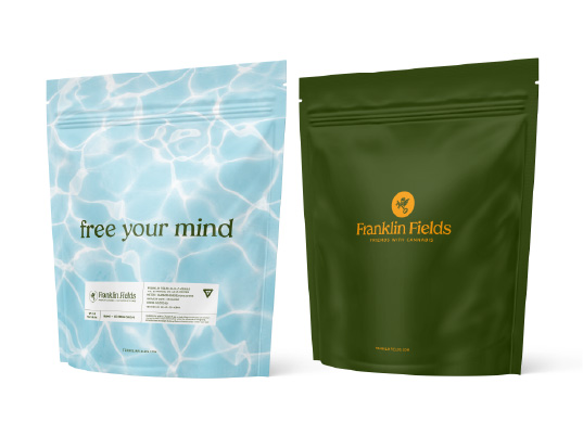
These elements work in concert to create a brand that is elevated, playful and surprising.
Credits
Role: Art Director, Lead Designer
Client: Carbidex / Franklin Fields
Year: 2020
Agency: Traction
Creative Director: Camron Gnass
Copywriter: n/a
Selected Works

Fenner Nature CenterBrand Design

Franklin FieldsProject type
Two Degrees°CreativeProject type
Type & LetteringProject type
LogosProject type