Two Degrees°Creative
When the global design community comes together to positively impact climate change.

Talk About A Challenge
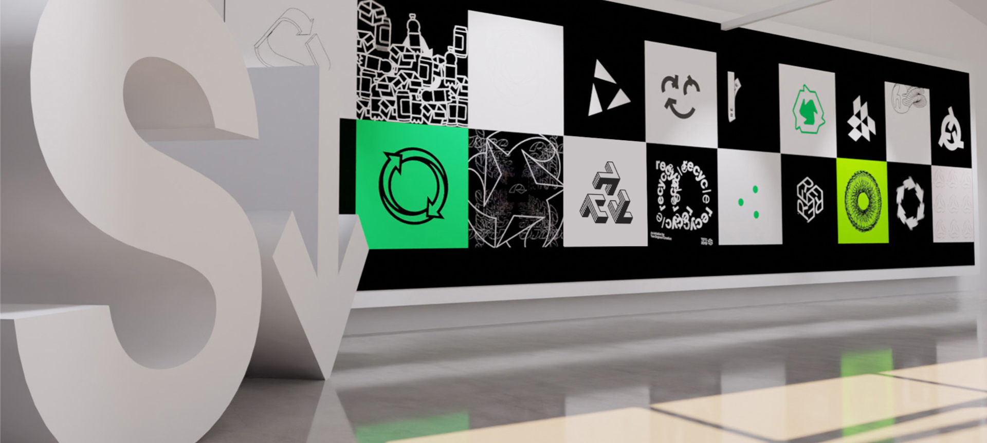
In May of 2019 I was invited by Two Degrees°Creative (TD°C) founder Ryan McGill to participate in an open brief to redesign Gary Anderson’s iconic recycling symbol.
TD°C mission was straightforward, utilize platforms like Instagram to engage with the global design community in an effort to raise awareness of, and positively impact climate change.

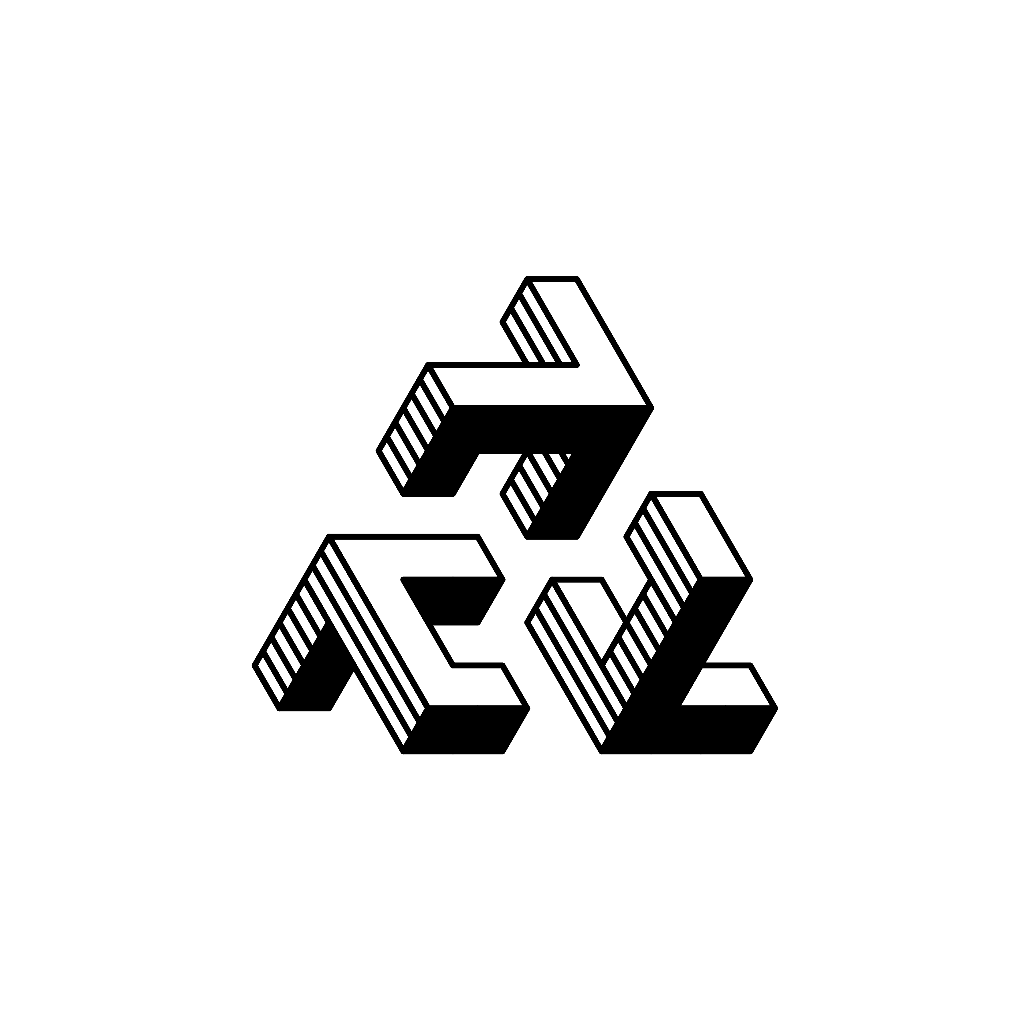
My First Submission
I knew that I wanted my submission to utilize motion. So I divised a dimensional solution that could be built as a frame animation in Photoshop.


This direction is certainly intersting. But truthfully, I regret that it's selection was ultimately a decision born from style rather than substance.
The patterns born from this intial exploration are also really interesting
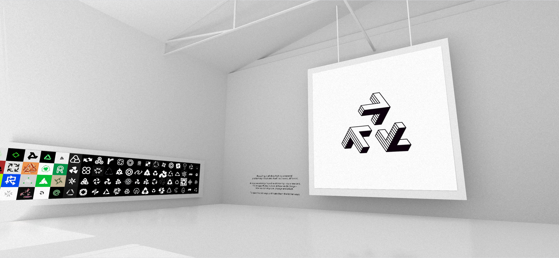
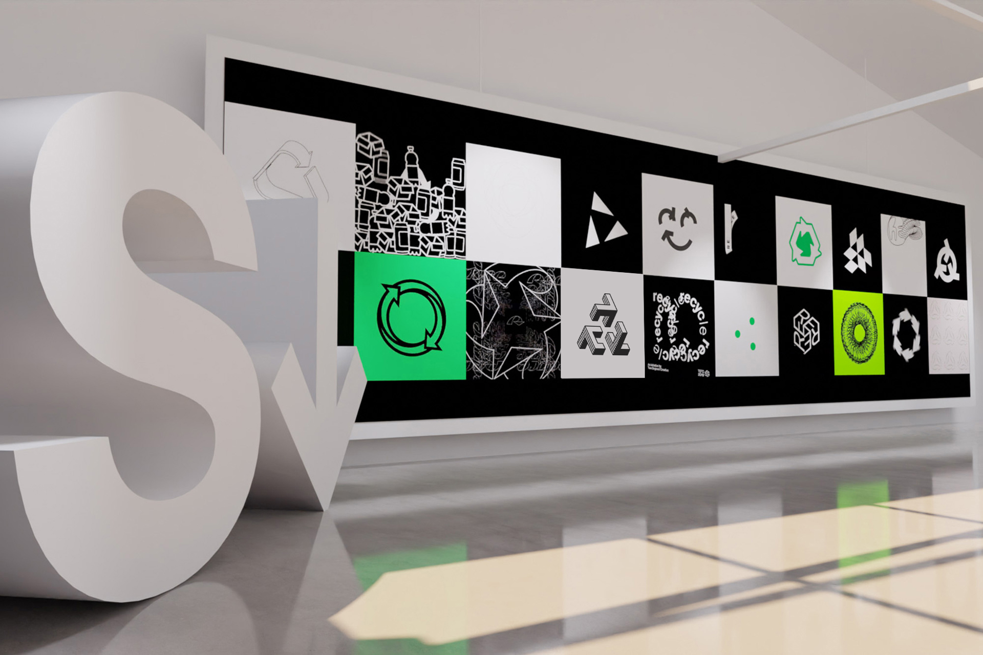
The project culminated in an interactive exhibition at Shutdown Gallery and was also featured on the The Brand Identity.

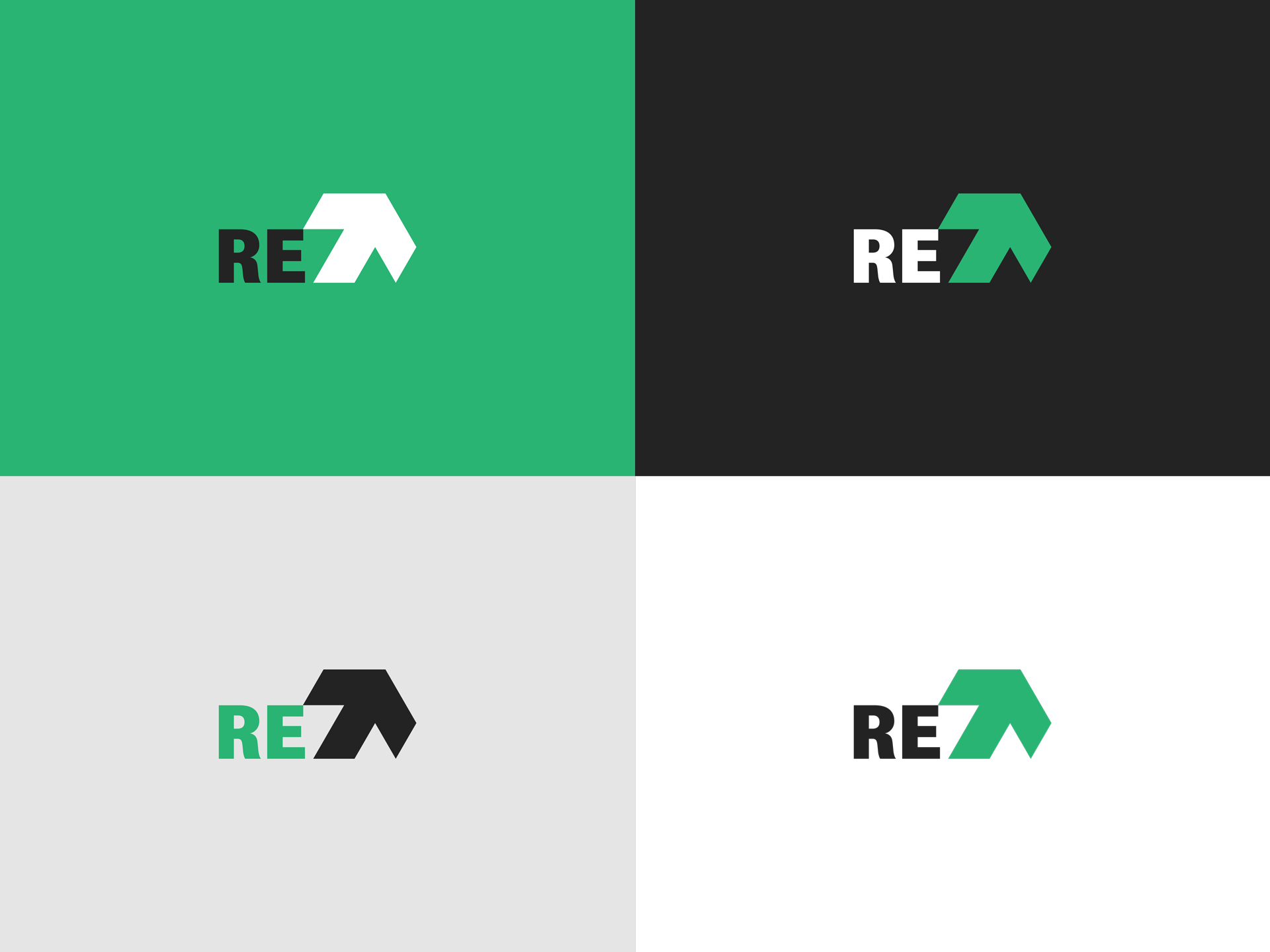
Do good and you will surely do great.
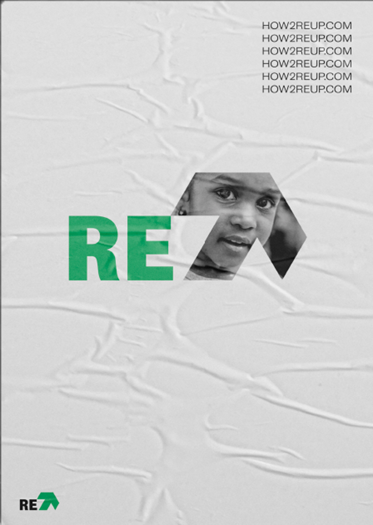
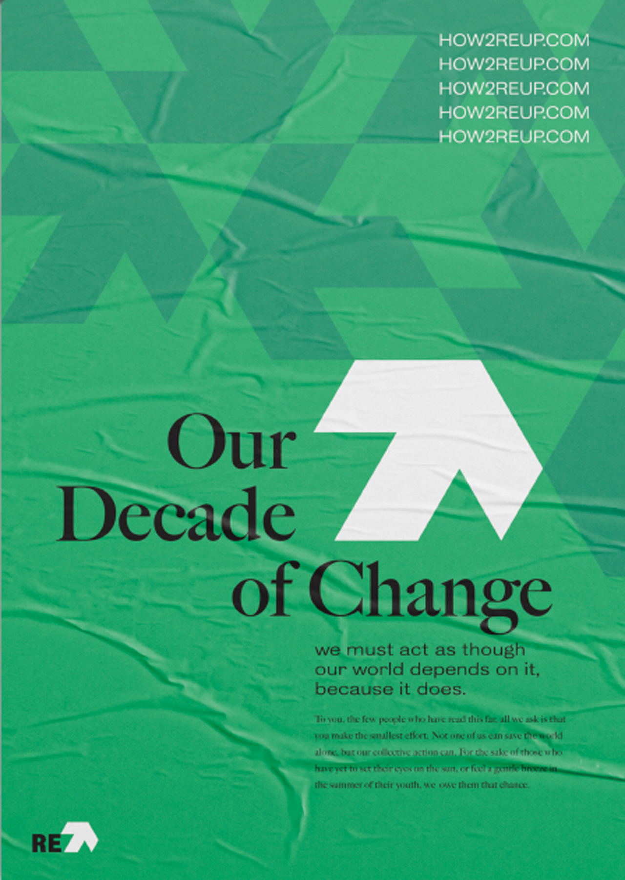
I pushed myself to develop one of the alternate directions into a campaign concept, because I want the work I put out in the world to be reflective of the work I want to do.
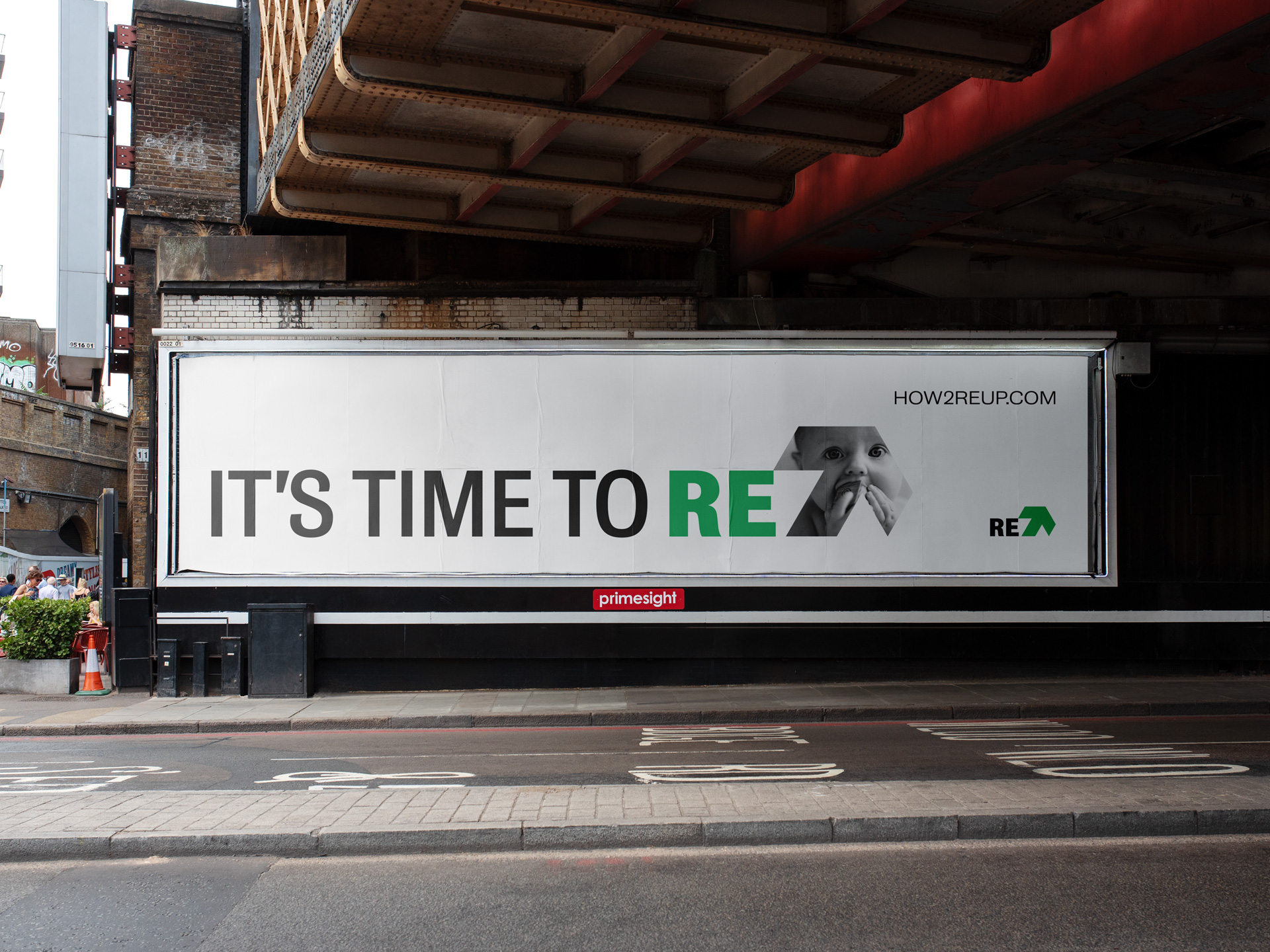
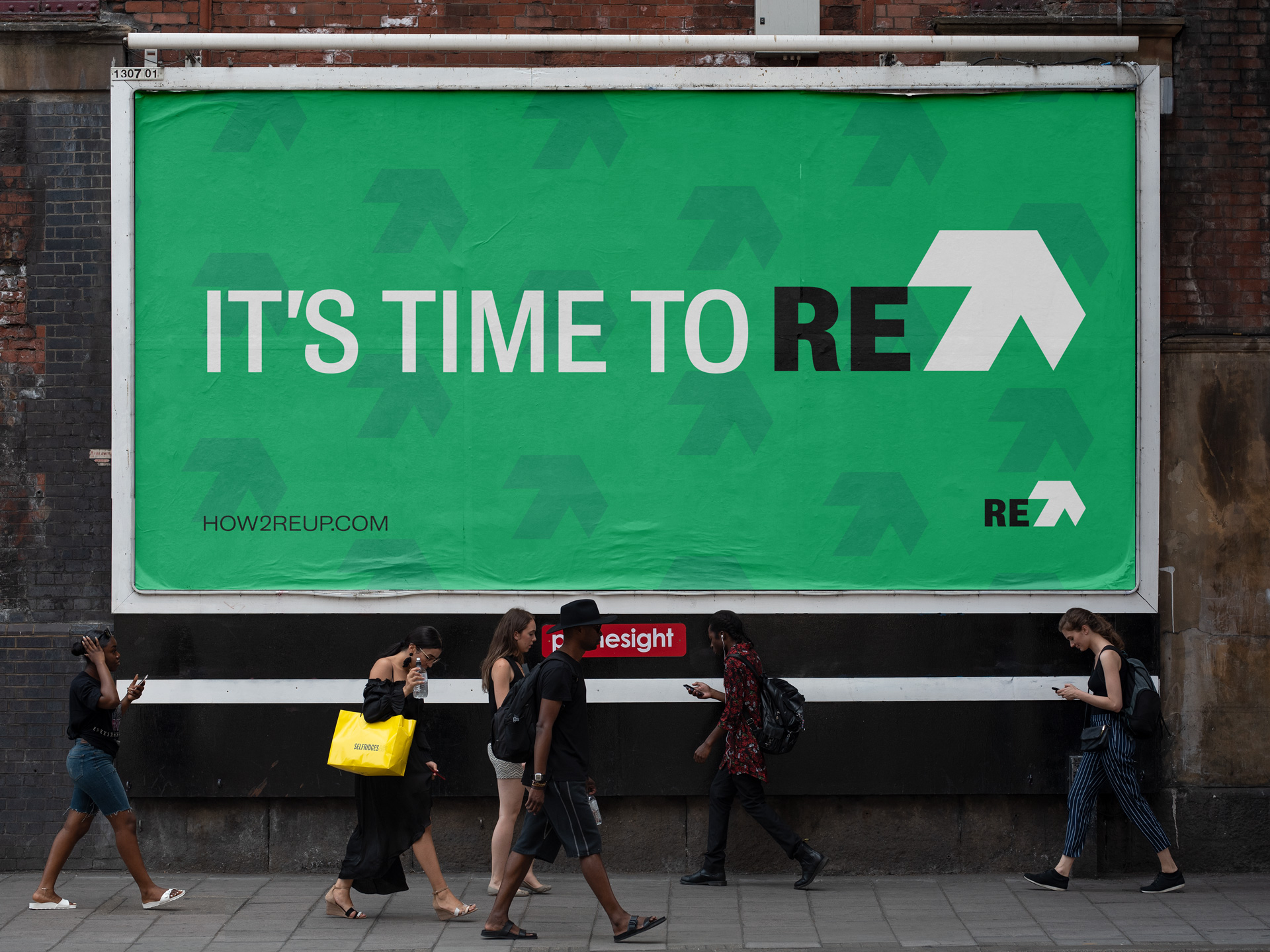
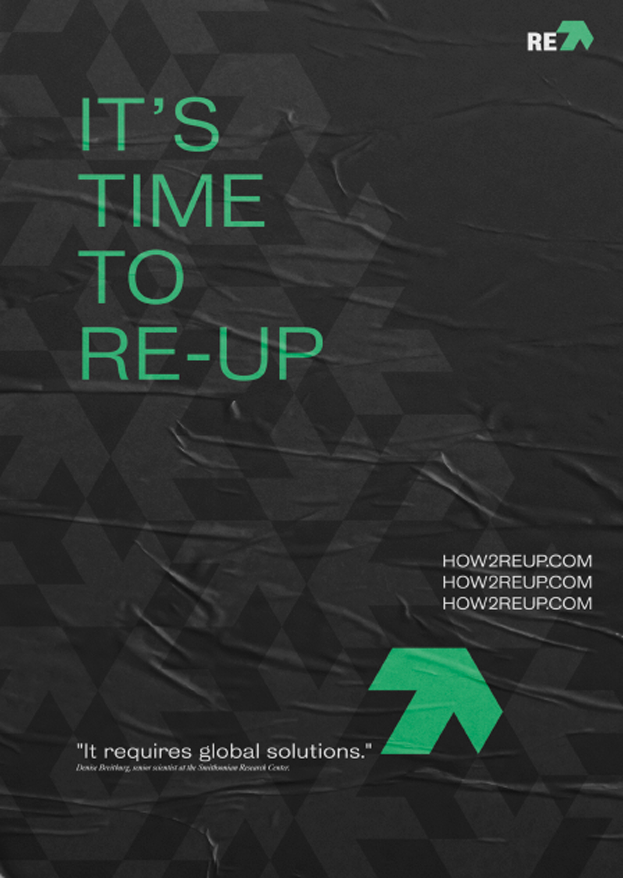
The name RE-UP, is a call to action, an opportunity for corporations and consumers to recommit to the environment.
The upward arrow became an aspirational push. With the goal of this 'organization' being one that could provide people with achievable, actionable steps for positive change.
We don’t inherit the planet from our ancestors, we borrow it from our children.
This can be easy to forget, so it was important that the younger generation is given a face and placed prominently in the advertising.

Credits
Role: Design, Strategy & Creative Direction
Client: Two Degrees°Creative
Year: 2019
Agency: n/a
Creative Director: n/a
Copywriter: n/a
Selected Works

Fenner Nature CenterBrand Design

Franklin FieldsProject type

Two Degrees°CreativeProject type
Type & LetteringProject type

LogosProject type
